Fluent 2021 and beyond...
January 27, 2021
In 2017, with a splashy upbeat animated extravaganza Microsoft debuted - Fluent - their new design system that was going to bring all their software across all platforms; web, Windows, iOS, and Android into clean futuristic lockstep.
Did it? — of course not. The streamlined interfaces that were teased in the original design video never appeared in shipping code. Like the ghosts of Longhorn demos past what made it to code from Director fakeries was nothing short of… meh.
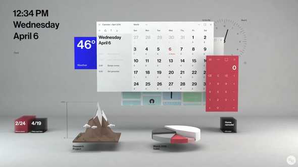
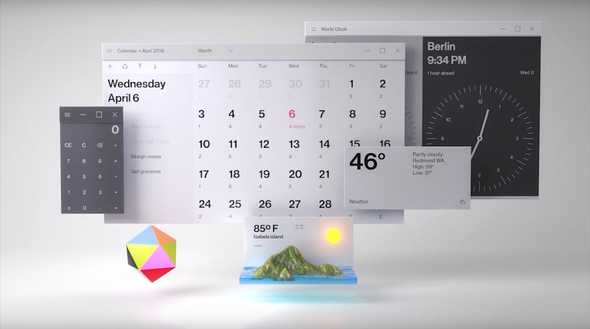
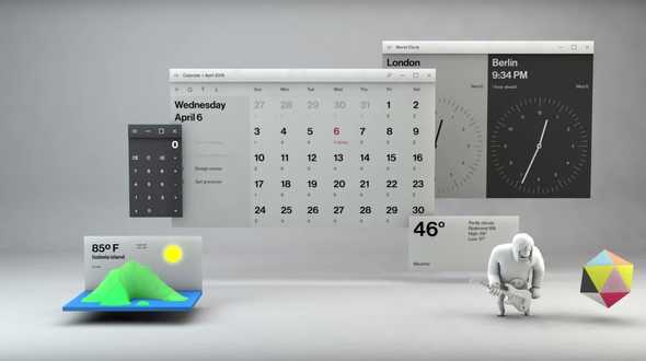
The demo video was littered with interesting concepts.
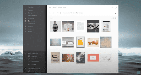
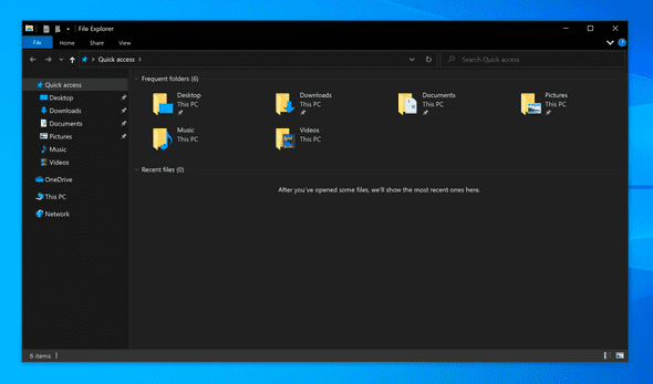
A clean vision of File Explorer, never seen in live code (above). Today the multi-decade version of Explorer.exe still creeps forward (below).
Calendars, widgets, 3D objects, and little characters playing guitars.
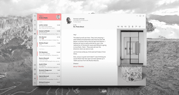
Microsoft Mail (below) — never shipped in this form.
Did any of this ship systemwide beyond pulsing circular gradients on buttons and sprinkles of translucency? No. A paint job so slow, so painful, by the time they have gotten to where they are they looked back to think — let’s look at the paint chips again.
Their checking of Sherman Williams has leaked and we now have rumblings of a new “big UI refresh” on deck for 2021. I have no doubt some new paint will hit Windows this year — but to what extent, to what completion? I’ll be interested to see.
